Here’s the New University of North Dakota Logo
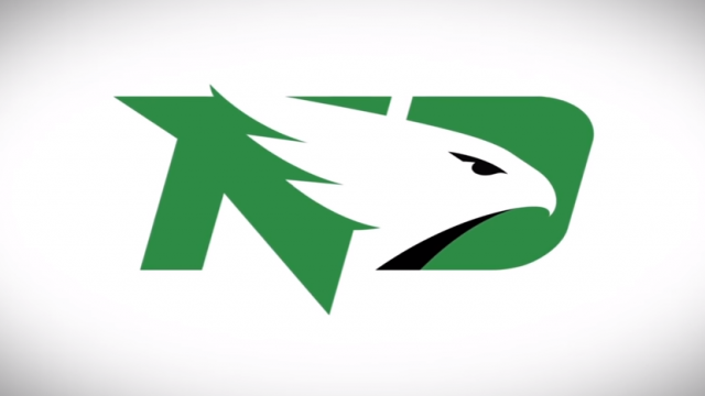
After a lengthy and expensive process, the University of North Dakota has a new logo to go along with their new “Fighting Hawks” nickname.
You can see the logo above and UND’s announcement video below.
My reaction? Meh. It’s not terribly exciting. In fact, it’s kind of boring. But then, “Fighting Hawks” is pretty boring, so what are you going to do?
Probably the one thing it’s got going for it is that it’s subtle. And subtlety is key for a fan base that very much wishes they never had to move on from the beloved Fighting Sioux logo/nickname. It also seems kind of soulless. But that’s what being politically correct is all about? Sucking the soul and the fun out of everything.
If you’re curious, SME (the company which won the contract to make the logo) charged UND $49,500 for this.
Frankly, I think some of the stuff that was floating around on social media which was created by students and fans was better.
UPDATE: A reader wonders if someone ripped off the U.S. Postal Service:

UPDATE: A parody from a reader:

Here’s the video: